Medical Device Color Matching and Aesthetics

Share:
We all agree that substance is what matters most – what’s inside, whether a person or a flex arm device, is what’s ultimately important. That said, matching the look for your device is integral to your design, not just because it “looks good” but because it sends a strong branded image to anyone who sees or uses it. Your device should never just look like components jumbled together, it needs a strong designed look. We don’t take that lightly. We’ve also been doing just that for a long, long time.
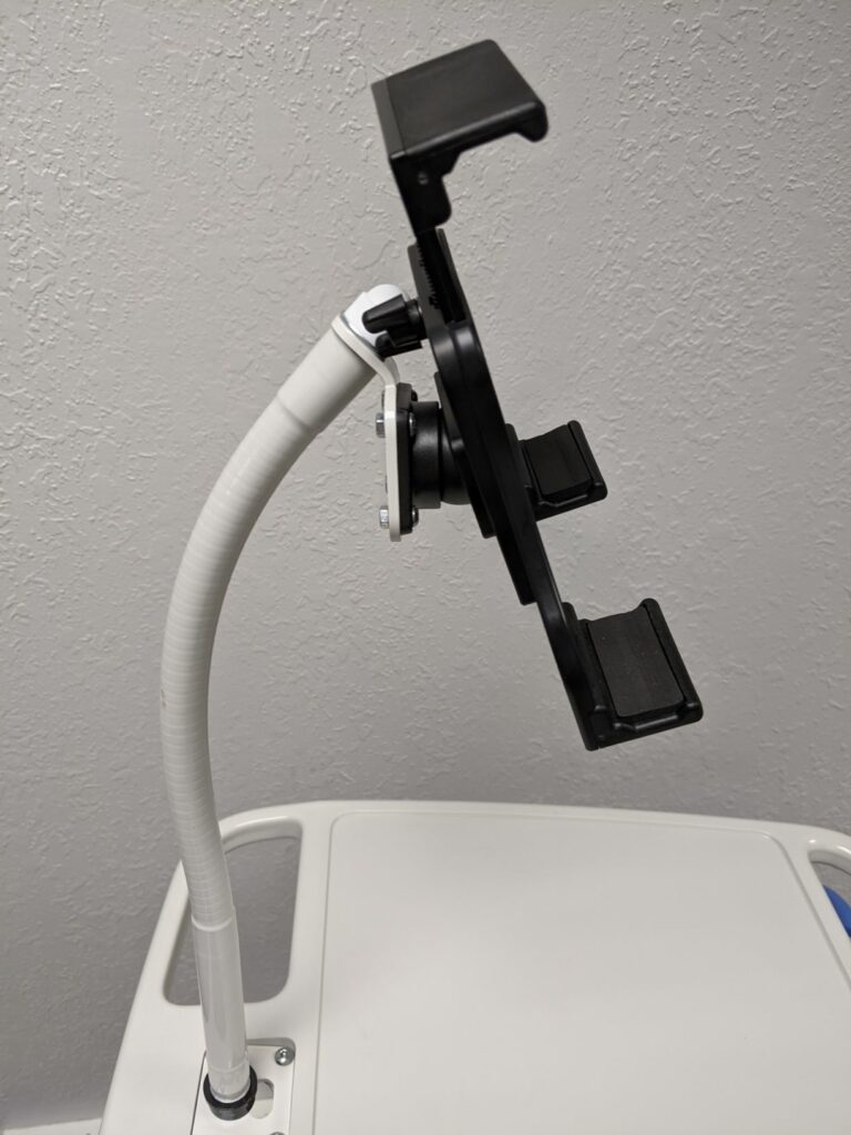
Our first experience with color matching and aesthetics goes back to our first Moffatt lamps for clients in the task lighting and machine tool industries. We often customized our lampshades and vinyl coverings to match the machine color and offered arm lengths ranging from 6 to 36 inches so it always looked right. And while the processes have changed some since then, we’ve continued to make it our mission that no matter the need, we aim for seamless integration with the medical device and mounting environment.
We get how important color matching for medical devices is for your team, which is why we instituted our design checklist
We run through a design checklist with your device so that we can ensure a quality product. That’s also to prevent unnecessary delays and backtracking that can really hurt a project. Why? Your device needs to check everyone on your team’s boxes – that includes your marketing team. Sometimes we’ll get a project to the five-yard line, but the look doesn’t match what they’re hoping for. No matter how well it functions, if the color or look is wrong, then that can be a big problem. Aesthetics matter.
Hospital settings require precise aesthetic choices
Your device might be the best in the world, but if it doesn’t look like it belongs in a hospital, you’ll be fighting an uphill battle the entire time. Hospitals project an image of cleanliness and uniformity – if your device is expected to be in one, it needs to blend in and keep looking great for a long time.
Complimentary colors can help devices maintain a uniform look – even when parts are made from different materials
Yes, hospitals need your device to have a uniform look. That doesn’t always mean that it has to be all-white or all-black. We often look at contrasting or complementary colors for parts that may be made from different materials. Let’s say you have two parts spec’d to one color, but one part is made of plastic and one has a metal finish. It’ll be pretty difficult to get those pieces to look the same, but a complimentary color can be a great solution to that problem.
People with color matching experience understand that the look and finish on small volume prototype parts often do not match the results you get from production tooling or high-volume runs. Leave room in your project timeline for your vendor to take multiple attempts in order to achieve just the right finish.
The best aesthetic results come with time, patience, and attention to detail
Often, we get color matching correct right off the bat. Sometimes though, we need a second or a third round to tweak the formula. That can be especially true if the client has strict color or aesthetic needs. To make sure we get it right, we’ll often send physical components in the color they asked to make sure that it’s right. We’ll send sample cards so that we can match textures.
These steps take time and communication. When you work with us, you’re getting a partner in this process. We’ll never just ship a package of components that don’t match and say, “good luck.” We’re with you in this process from start to finish. Are you ready to start your next project? So are we.